POKER PURE MALT
Packaging
several media
Category
visual systems,
beer
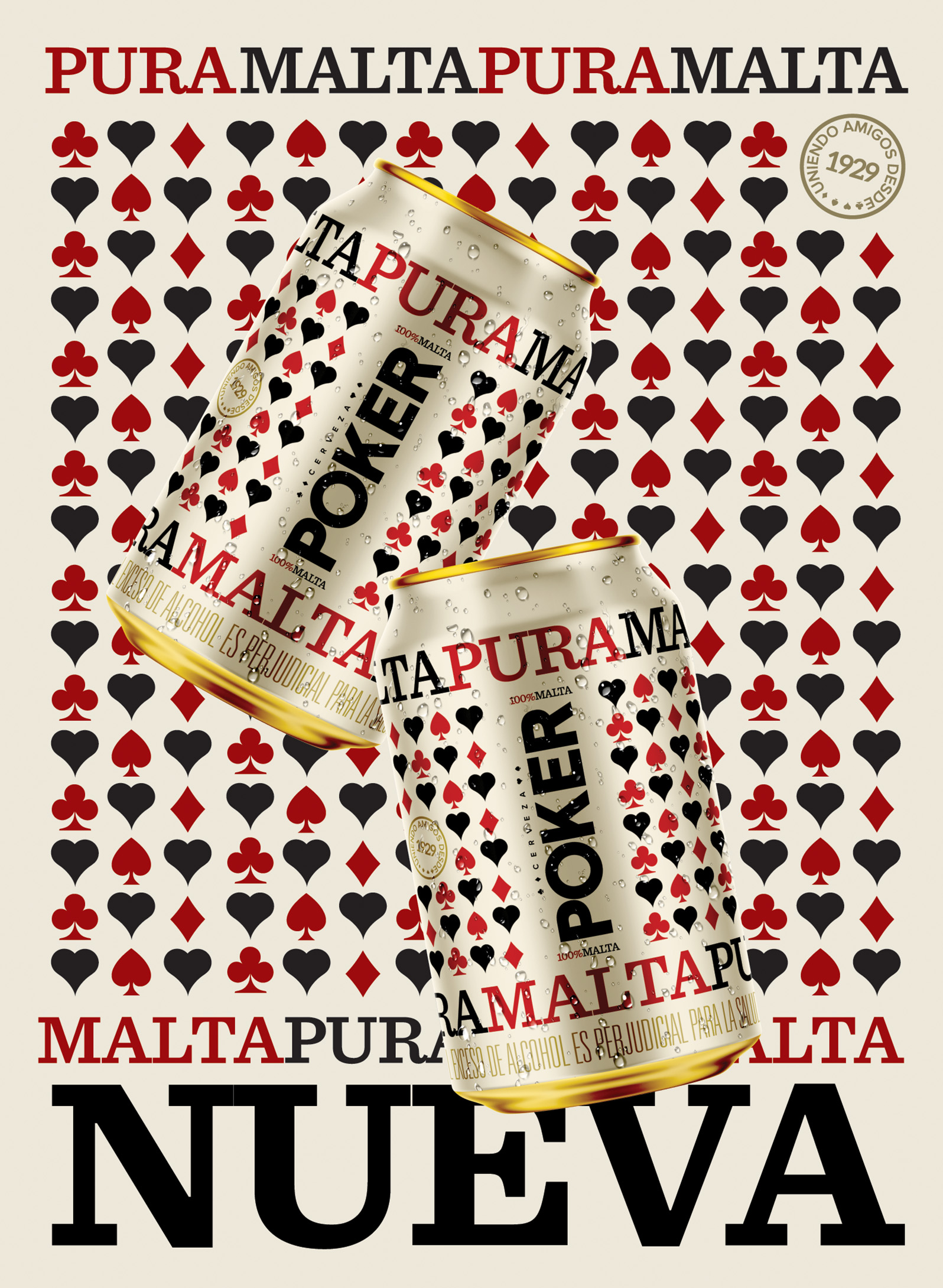
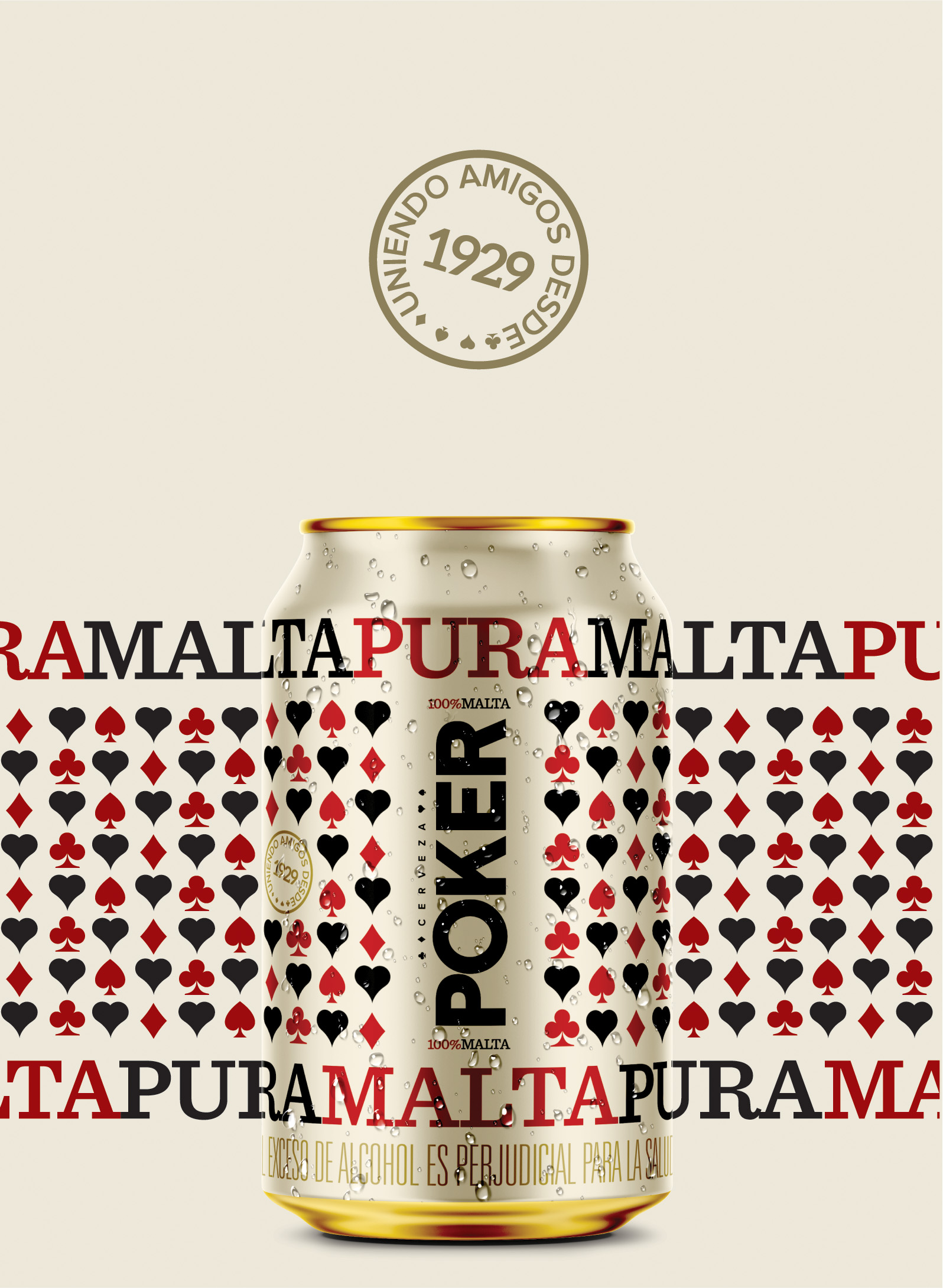
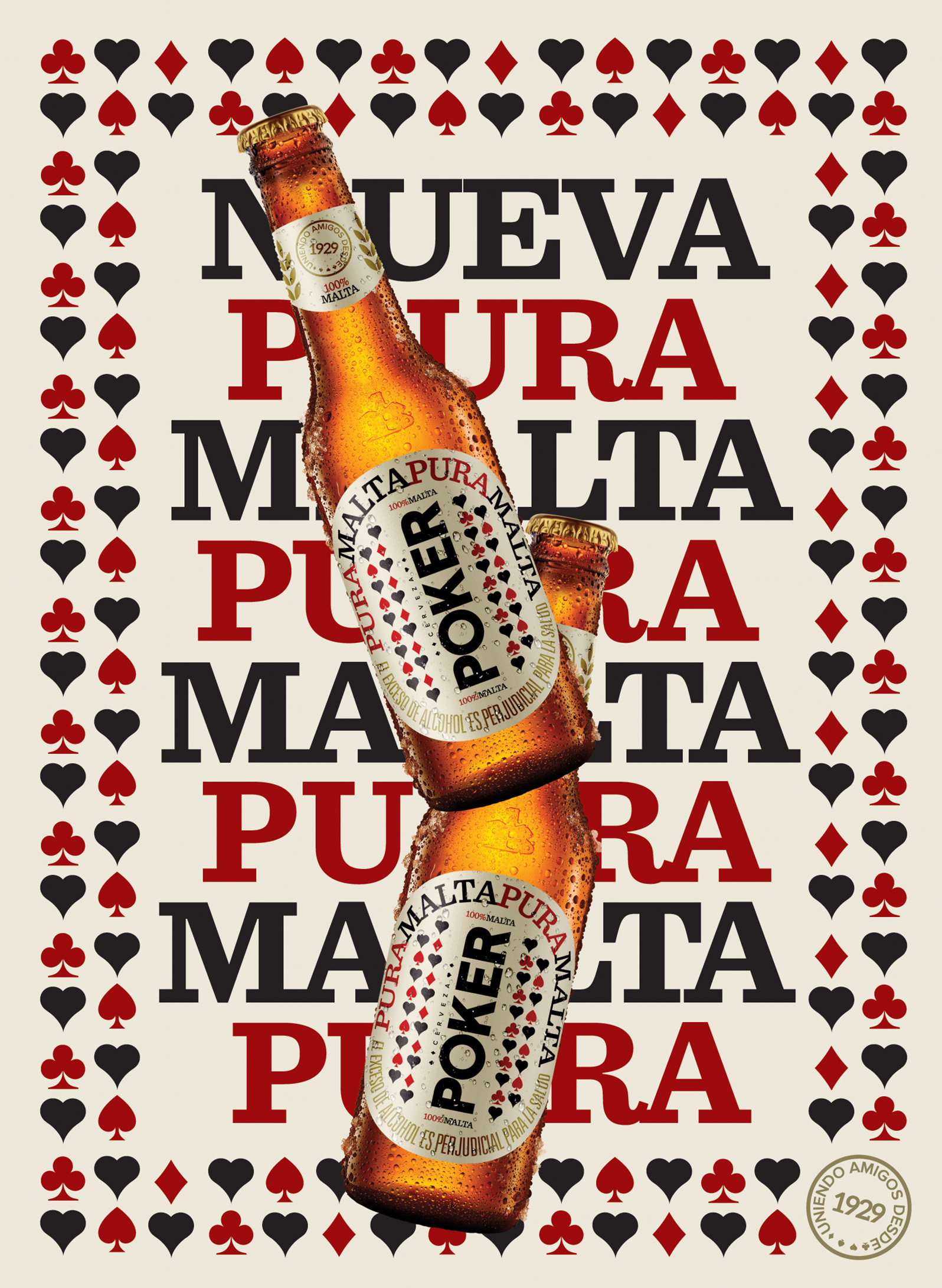
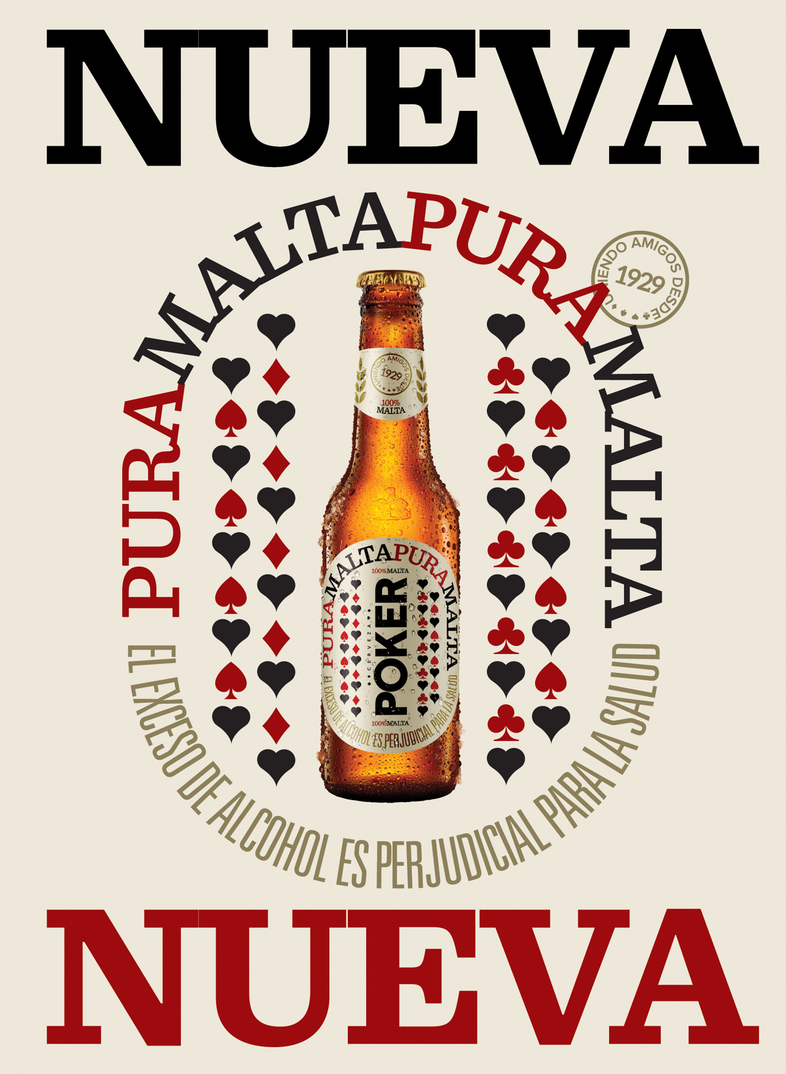
For the new "Pure Malt" special edition of the popular Colombian beer "Poker", I set out to create a simple yet bold design with the existing elements of the brand. The playful repetition of the words PURE MALT and of poker card symbols proved to be a great way to create appealing visual patterns and communicate the essence of this new beer: Poker is pure malt and nothing more.


Year
2020 (unpublished)
Design Studio
Lip
Creative Direction
Lucho Correa
Art Direction & Design
Camilo Baquero
Client
Bavaria - AB InBev